21 Best Email Platforms With Built-In Analytics (2026)

Every email platform claims to have analytics. But the range goes from "here's your open rate" to comprehensive dashboards with cohort analysis, deliverability monitoring, and engagement scoring. The difference determines whether you can actually optimize your email program or you're just looking at vanity metrics.
Good email analytics answer three questions: Are my emails reaching the inbox? Are people engaging with them? Are they driving the outcomes I want? Basic platforms answer the first two. The best ones answer all three.
For a deep dive into which metrics actually matter and how to track them, see our guide to SaaS email marketing KPIs.
What to Look for in Email Analytics
Delivery metrics: Sent, delivered, bounced (hard vs. soft), deferred, rejected. You need to know if emails are reaching inboxes, not just leaving your server.
Engagement metrics: Opens, clicks, click-to-open rate, read time, link-level click tracking. Goes beyond "did they open" to "what did they do."
List health metrics: Growth rate, churn rate, engagement distribution, inactive subscriber percentage. Tells you if your list is healthy or decaying.
Deliverability metrics: Inbox placement, spam placement, spam complaint rate, domain reputation. The metrics that actually determine if your emails get seen. For a comprehensive guide to managing these, see our email deliverability guide.
Conversion metrics: Conversions attributed to email, revenue per email, goal completion rates. Connects email engagement to business outcomes. This is where analytics move from informational to actionable.
Cohort analysis: Comparing performance across subscriber groups (by join date, segment, campaign source). Shows whether your email program is improving over time or just maintaining.
Quick Comparison
| Tool | Best For | Starting Price | Free Tier | Analytics Depth |
|---|---|---|---|---|
| Sequenzy | SaaS analytics | From $19/mo | No (2.5k emails free) | SaaS metrics + Stripe revenue attribution |
| Klaviyo | Comprehensive dashboard | From $20/mo | Yes (250 contacts) | Revenue attribution, cohort analysis, predictive |
| ActiveCampaign | CRM + email analytics | From $29/mo | No | Pipeline attribution, engagement scoring |
| Postmark | Deliverability analytics | From $15/mo | No | Delivery tracking, bounce categorization |
| Mailchimp | Beginners | From $13/mo | Yes (500 contacts) | Industry benchmarks, click maps |
| Customer.io | Event-based analytics | From $100/mo | No | Data explorer, workflow analytics |
| SendGrid | High-volume delivery | From $20/mo | Yes (100/day) | Category stats, API access |
| HubSpot | Marketing + sales teams | From $20/mo | Yes (CRM) | CRM integration, attribution |
| Kit (ConvertKit) | Creators | From $25/mo | Yes (10k subs) | Subscriber engagement tracking |
| MailerLite | Solo marketers | From $10/mo | Yes (1k subs) | Clean, simple analytics |
| Brevo | SMB multichannel | From $9/mo | Yes (300/day) | Multichannel analytics |
| GetResponse | Funnel builders | From $19/mo | Yes (500 contacts) | Conversion funnel analytics |
| Omnisend | Ecommerce automation | From $19/mo | No | Omnichannel attribution |
| Campaign Monitor | Brand-conscious teams | From $11/mo | No | Clean reporting, client dashboards |
| Drip | Ecommerce | From $39/mo | No | Revenue tracking, lifecycle analytics |
| Iterable | Cross-channel | Custom | No | Customer journey analytics |
| Braze | Mobile-first apps | Custom | No | Real-time analytics, deep integrations |
| Moosend | Affordable automation | From $9/mo | No | Automation analytics, landing page tracking |
| AWeber | Small business | From $19/mo | No | Detailed campaign reports |
| Mailgun | Developers | From $35/mo | Yes (5k/mo) | Delivery debugging, API analytics |
| SparkPost | High-volume senders | From $20/mo | No | Deliverability insights |
The 21 Best Options
1. Sequenzy
Best for: SaaS-focused analytics connecting email to subscription metrics
Sequenzy's analytics connect email performance to SaaS business metrics. Campaign and sequence reports show standard engagement metrics (opens, clicks) alongside subscription outcomes. When connected to Stripe, you can see how email sequences impact trial conversion, churn reduction, and revenue recovery.
The analytics are designed for SaaS founders who care about MRR impact, not just open rates. Seeing "this dunning sequence recovered $2,400 in failed payments" is more actionable than "this campaign had a 22% open rate."
Sequence-level analytics are where Sequenzy's reporting becomes particularly useful. Instead of looking at individual email metrics in isolation, you see the performance of entire sequences as a unit. How many subscribers entered the onboarding sequence? How many completed it? What's the conversion rate at each step? Where do subscribers drop off?
For dunning email sequences, the analytics tie directly to revenue outcomes. You see not just email opens and clicks, but actual payment recoveries attributed to the sequence. This makes it straightforward to calculate the ROI of your dunning automation.
The Stripe integration powers revenue attribution without custom event tracking. Because Sequenzy reads subscription data directly, it can correlate email engagement with subscription events (upgrades, downgrades, churn, reactivation) automatically.
- Analytics depth: Good. Email metrics + SaaS business outcomes, sequence performance, revenue attribution
- Pricing: Free up to 2,500 emails/month, paid plans from $19/month
- Pros: SaaS-relevant metrics, subscription outcome tracking, revenue impact, actionable, sequence-level reporting
- Cons: Less detailed than Klaviyo for granular analysis, newer platform
2. Klaviyo
Best for: The most comprehensive email analytics dashboard
Klaviyo's analytics go deeper than any other email platform. Campaign reports show standard metrics plus revenue attribution, benchmark comparisons, and predictive analytics. Flow analytics show conversion rates at each step, revenue per email, and drop-off points.
The dashboard includes cohort analysis (how do users who joined in January compare to February?), engagement scoring (automated scoring based on email and purchase behavior), and deliverability monitoring. You can build custom reports combining email metrics with customer data.
Klaviyo's custom report builder is the most flexible in the industry. Combine email engagement metrics with customer attributes, purchase behavior, and product data to create reports that answer specific business questions. "What's the average order value for customers who clicked our product recommendation emails?" is a query Klaviyo can answer.
The predictive analytics layer adds forward-looking metrics. Expected date of next order, predicted customer lifetime value, and churn risk score give you actionable data about what's likely to happen, not just what already happened. For e-commerce businesses with sufficient data (500+ customers, 6+ months of history), these predictions are genuinely useful.
The benchmarking feature compares your metrics against similar businesses on Klaviyo's platform, giving you context that standalone analytics can't provide.
- Analytics depth: Excellent. Revenue attribution, cohort analysis, predictive analytics, custom reports, benchmarking
- Pricing: Free up to 250 contacts, from $20/month
- Pros: Most comprehensive analytics, revenue tracking, cohort analysis, engagement scoring, custom reports
- Cons: E-commerce-focused, analytics can be overwhelming, pricing scales with contacts
3. ActiveCampaign
Best for: Analytics that connect email engagement to the sales pipeline
ActiveCampaign's analytics span email marketing and CRM. Campaign reports show opens, clicks, and conversions. Automation reports show performance at each workflow step. The CRM adds deal attribution, showing how email engagement influences pipeline movement.
The engagement scoring system automatically tracks each contact's engagement level. You can see engagement trends over time, identify your most engaged segments, and spot contacts that are becoming disengaged. This makes list health visible without manual analysis.
The automation reporting is where ActiveCampaign's analytics stand out. For each automation workflow, you see: entry rate (how many contacts enter), completion rate (how many reach the end), conversion rate (how many achieve the goal), and performance at each individual step. This granularity lets you identify exactly which email in a sequence is underperforming.
For B2B SaaS companies with a sales component, the CRM analytics add a dimension that pure marketing tools miss. See which email campaigns influenced closed deals, track the email touchpoints in your sales pipeline, and attribute revenue to specific automations.
The site tracking integration connects email engagement to website behavior. See which pages contacts visit after clicking an email link, how long they stay, and what actions they take. This closes the loop between email engagement and on-site conversion.
- Analytics depth: Very good. Email + CRM analytics, engagement scoring, automation reports, site tracking
- Pricing: From $29/month
- Pros: CRM + email analytics, engagement scoring, automation step analysis, deal attribution, site tracking
- Cons: Some analytics features on higher tiers, can feel scattered across multiple dashboards
4. Postmark
Best for: The best deliverability analytics in email
Postmark's analytics focus on what matters most for transactional email: deliverability. The dashboard shows delivery rates, bounce rates (broken down by type), spam complaint rates, and delivery speed. You can track these metrics per message stream (transactional vs. marketing), per tag, and per time period.
The bounce management is particularly good. Postmark categorizes bounces (hard bounce, soft bounce, spam block, etc.) and provides actionable details. The activity feed shows every email's journey from send to delivery (or bounce), making debugging straightforward.
Postmark's delivery speed metrics are unique. Most platforms tell you "delivered." Postmark tells you how fast. Average delivery time, 95th percentile delivery time, and delivery time distribution give you visibility into whether your transactional emails are arriving in seconds or minutes. For password resets and OTP codes, this matters.
The message stream analytics keep transactional and marketing metrics separate. This is important because transactional emails should have near-perfect deliverability (99%+), while marketing emails typically have lower rates. Mixing the two obscures problems. Postmark's separation makes issues visible immediately.
The activity feed is the best debugging tool in email analytics. Search for any email by recipient, subject, tag, or message stream. See exactly what happened: when it was sent, when (or if) it was delivered, any bounce information, and engagement events. For troubleshooting delivery issues, this level of detail is invaluable.
- Analytics depth: Excellent for deliverability. Delivery tracking, bounce categorization, speed metrics, activity feed
- Pricing: From $15/month
- Pros: Best deliverability analytics, bounce categorization, delivery speed tracking, message streams, activity feed
- Cons: Limited marketing analytics, no revenue attribution, focused on transactional
5. Mailchimp
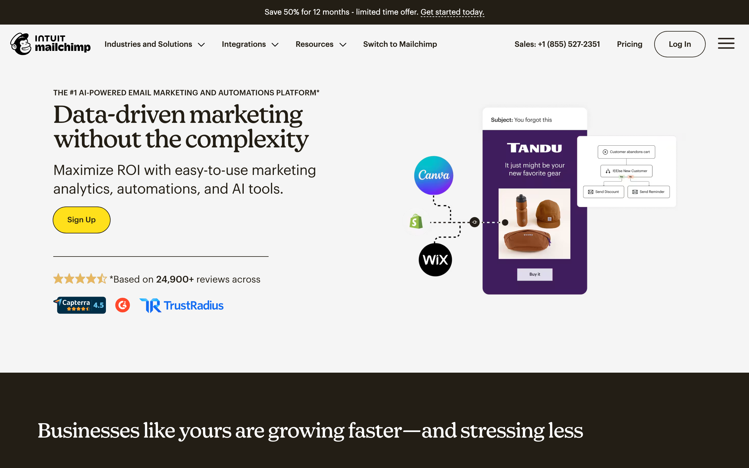
Best for: Accessible analytics for small businesses and beginners
Mailchimp's analytics are the most accessible in the industry. Campaign reports are clean, easy to read, and include industry benchmarks so you know how your numbers compare. The audience dashboard shows growth, engagement, and demographics at a glance.
For small businesses sending occasional campaigns, Mailchimp's analytics provide enough insight without being overwhelming. Open rates, click rates, top links, subscriber growth, and basic revenue tracking (with e-commerce integration) cover the essentials.
The industry benchmarking is Mailchimp's analytics superpower. Because Mailchimp processes billions of emails across millions of accounts, their benchmarks are statistically robust. Knowing that your 22% open rate is above average for your industry provides context that standalone metrics can't.
The audience dashboard provides a quick health check. At a glance, you see subscriber growth trend, engagement distribution, top locations, and predicted demographics. For beginners who aren't sure what to measure, this dashboard surfaces the most important signals without requiring configuration.
The click map feature shows exactly where recipients clicked within your email. This visual representation helps you understand which content and CTAs drive engagement, which is more intuitive than a table of link-level click rates.
- Analytics depth: Good for basics. Clean dashboard, benchmarks, audience insights, click maps
- Pricing: Free up to 500 contacts, from $13/month
- Pros: Most accessible, industry benchmarks, clean UI, audience demographics, click maps
- Cons: Limited advanced analytics, basic segmentation insights, shallow automation analytics
6. Customer.io
Best for: Technical teams wanting granular event-based analytics
Customer.io's analytics are built around events and automations. See how users move through workflows, where they convert or drop off, and how different segments respond to each message. The data explorer lets you build custom queries against your engagement data.
The automation analytics are particularly strong. See conversion rates at each step, compare A/B test variants, and identify which branches perform best. For technical teams that want to optimize at the workflow step level, Customer.io provides the granularity.
The data explorer is Customer.io's most powerful analytics feature. Build custom queries combining event data, customer attributes, and email engagement. "Show me users who received the onboarding sequence, didn't click any email, but still converted to paid" is a query you can build. This flexibility is unmatched for teams that think in data rather than dashboards.
Customer.io also excels at A/B test analytics. Run tests not just on email content, but on entire workflow branches, timing, and send conditions. The analytics show statistical significance, confidence intervals, and projected impact, giving you the data to make informed optimization decisions.
For teams focused on behavioral email marketing, Customer.io's event-based analytics provide the most natural reporting model. See how specific user actions (events) correlate with email engagement and downstream conversions.
- Analytics depth: Very good. Workflow step analytics, data explorer, A/B testing, conversion tracking, event correlation
- Pricing: From $100/month
- Pros: Granular workflow analytics, data explorer, A/B analysis, conversion tracking, event-based
- Cons: Expensive, complex interface, requires investment to configure properly
7. SendGrid
Best for: Email delivery analytics at high volume
SendGrid's analytics focus on delivery and engagement at scale. The dashboard shows delivery rate, bounce rate, spam reports, and engagement metrics across your entire sending volume. Category-level stats let you segment analytics by email type (transactional vs. marketing, receipts vs. notifications).
The Stats API lets you pull analytics data programmatically, which is useful for building custom dashboards or feeding email metrics into your own analytics pipeline. At high volume, the ability to analyze sending patterns and identify delivery issues across millions of emails is valuable.
The category system is SendGrid's strongest analytics feature. Tag every email with categories (transaction type, campaign name, user segment) and analyze performance by category. This is particularly useful for developer-friendly email setups where you want to analyze email performance programmatically within your own analytics stack.
The Event Webhook provides real-time analytics data. Every email event (delivered, opened, clicked, bounced, unsubscribed) is delivered to your endpoint. Teams that build custom analytics dashboards or feed email data into tools like Mixpanel or Amplitude use this extensively.
SendGrid's Expert Insights feature (on higher plans) provides AI-powered recommendations for improving deliverability and engagement based on your sending patterns. It identifies anomalies, suggests optimal sending volumes, and flags potential reputation issues before they become problems.
- Analytics depth: Good for delivery. Volume analytics, category stats, API access, real-time events
- Pricing: Free for 100 emails/day, from $20/month
- Pros: High-volume analytics, category segmentation, Stats API, delivery focus, event webhook
- Cons: Marketing analytics less polished, dashboard feels dated, limited automation analytics
8. HubSpot
Best for: Marketing teams that want email analytics tied to CRM and sales data
HubSpot's email analytics shine because they connect email performance to the full customer journey. Campaign reports show standard engagement metrics, but also attribution to deals, pipeline influence, and revenue impact. When an email helps close a deal, you can see exactly which touchpoints mattered.
The reporting is particularly strong for B2B teams with long sales cycles. Track how email engagement influences deal progression, which campaigns drive the most qualified leads, and how email nurturing affects close rates. This full-funnel visibility is rare outside dedicated B2B platforms.
HubSpot's attribution reporting connects email to revenue. See first-touch, last-touch, and multi-touch attribution for your email campaigns. Understand which emails start conversations versus which ones close deals. For marketing teams that need to prove ROI to sales leadership, this attribution data is essential.
The list health analytics provide actionable insights. See engagement distribution, subscription growth, and unsubscribe trends segmented by list and source. HubSpot also tracks email performance over time, making it easy to spot seasonal patterns or the impact of strategy changes.
For teams already using HubSpot CRM, the email analytics integrate seamlessly with contact records, company data, and deal information. You don't need to switch between systems to understand how email performance connects to business outcomes.
- Analytics depth: Very good. Full-funnel attribution, CRM integration, revenue tracking, list health
- Pricing: Free with HubSpot CRM, Marketing Hub from $20/month
- Pros: CRM-connected analytics, deal attribution, revenue tracking, full-funnel visibility
- Cons: Expensive at higher tiers, email features locked behind Marketing Hub, overkill for simple use cases
9. Kit (formerly ConvertKit)
Best for: Creator-focused analytics that simplify subscriber engagement
Kit's analytics are designed for creators who care about subscriber engagement more than granular metrics. The dashboard shows open rates, click rates, and subscriber growth in a clean, straightforward interface. You get the essentials without being overwhelmed by data.
The subscriber analytics are particularly useful for creators. See which subscribers are most engaged, track growth over time, and understand how different content types perform. The tagging system lets you analyze performance by subscriber interest segments, helping you understand what your audience actually wants.
Kit's commerce analytics connect email to revenue for creators selling products, courses, or paid newsletters. Track how email campaigns drive product sales, which emails generate the most revenue, and which subscribers are your best customers. For creators building businesses around their audience, this revenue visibility is essential.
The broadcast analytics show clear performance metrics for one-time sends. Compare subject line performance, see which content resonates, and identify the best send times for your audience. The reporting is less detailed than Klaviyo but more actionable for most creator use cases.
Kit's recommendation engine suggests content improvements based on your analytics. The platform identifies your best-performing emails and suggests similar topics, helping you iterate on what works rather than guessing.
- Analytics depth: Good for creators. Subscriber engagement, revenue tracking, simple comparative reporting
- Pricing: Free up to 10,000 subscribers, from $25/month
- Pros: Creator-focused, simple and clean, revenue tracking for products, engagement insights
- Cons: Less detailed than comprehensive platforms, limited automation analytics, no cohort analysis
10. MailerLite
Best for: Solo marketers who want clean, simple analytics without complexity
MailerLite's analytics strike a balance between simplicity and usefulness. Campaign reports show the essential metrics: opens, clicks, unsubscribes, and geographical data. The dashboard is clean and easy to understand, making it perfect for marketers who don't want to spend hours analyzing data.
The A/B testing analytics are straightforward and actionable. Run subject line tests, content tests, or sender tests, and see clear results with statistical significance. MailerLite presents the winner prominently and shows the percentage difference, making it easy to decide which version to send.
Subscriber analytics show engagement over time. See who's most active, identify inactive subscribers, and track growth trends. The platform also provides basic list health metrics like engagement distribution and unsubscribe patterns. For solo marketers, this level of insight is usually sufficient.
MailerLite's landing page analytics integrate with email campaigns. Track how many email recipients visit your landing pages, convert on forms, or complete specific actions. This basic attribution helps you understand which email campaigns drive actual results beyond opens and clicks.
The automation analytics show performance at each step of a workflow. See entry rates, open rates, click rates, and conversion rates for automated sequences. Identify where subscribers drop off and optimize your flows accordingly.
- Analytics depth: Good for basics. Clean reporting, A/B testing, subscriber insights, automation analytics
- Pricing: Free up to 1,000 subscribers, from $10/month
- Pros: Simple and intuitive, good A/B testing, landing page integration, affordable
- Cons: Limited advanced analytics, no revenue attribution, basic segmentation insights
11. Brevo (formerly Sendinblue)
Best for: SMBs wanting multichannel analytics on a budget
Brevo's analytics cover email, SMS, and WhatsApp in one dashboard. For small businesses using multiple channels, this unified view is valuable. See how email performance compares to SMS, understand which channels your audience prefers, and optimize your multichannel strategy.
The email analytics are competent rather than exceptional. Standard engagement metrics (opens, clicks, unsubscribes) plus basic deliverability tracking. The automation analytics show workflow performance with conversion rates at each step. For most SMB campaigns, this is sufficient.
Brevo's per-send pricing model means you can send to large lists selectively without paying for contacts you don't email. This makes analytics-focused experimentation more affordable - you can test different segments without worrying about contact-based pricing.
The SMS analytics show delivery rates, click rates (for link-in-SMS campaigns), and opt-out rates. WhatsApp analytics provide similar visibility. For businesses that rely on SMS for urgent communications or cart abandonment, this cross-channel reporting helps you understand which channel performs best for which use case.
The platform's basic CRM provides simple contact timeline analytics. See every email, SMS, and WhatsApp interaction in one place. This unified contact history is useful for small teams that don't have a full CRM but want to understand customer engagement across channels.
- Analytics depth: Good for multichannel. Email + SMS + WhatsApp, automation analytics, contact timelines
- Pricing: Free up to 300 emails/day, from $9/month
- Pros: Multichannel analytics, per-send pricing, affordable, basic CRM integration
- Cons: Email analytics less detailed than dedicated platforms, limited advanced features
12. GetResponse
Best for: Marketers building funnel-focused analytics with landing pages and webinars
GetResponse's analytics emphasize conversion funnels. Track visitors from landing page through email sequences to webinar registrations or purchases. The platform shows conversion rates at each funnel stage, helping you identify where prospects drop off.
The email analytics are standard but solid. Opens, clicks, unsubscribes, and basic deliverability metrics. The automation analytics provide workflow step-by-step breakdowns, showing entry rates, open rates, click rates, and conversions. For funnel optimization, this visibility is useful.
GetResponse's webinar analytics integrate with email marketing. See how many email recipients registered for webinars, attended live, or watched recordings. Track which email campaigns drive the most webinar engagement. For B2B marketers using webinars as a primary lead generation channel, this integration saves time connecting data sources.
The landing page analytics show visitor sources, conversion rates, and how email traffic performs compared to other channels. Understand which email campaigns drive the most qualified landing page visitors and optimize your funnel accordingly.
The AI recommendations feature analyzes your past campaigns and suggests optimal send times, subject line improvements, and content enhancements. It's not as sophisticated as Klaviyo's predictive analytics, but for teams getting started with data-driven optimization, it provides helpful guidance.
- Analytics depth: Good for funnels. Conversion tracking, webinar integration, landing page analytics, basic AI insights
- Pricing: Free up to 500 contacts, from $19/month
- Pros: Funnel-focused analytics, webinar integration, landing page tracking, all-in-one reporting
- Cons: Email analytics less detailed than specialized platforms, dated UI, mid-tier deliverability
13. Omnisend
Best for: Ecommerce brands wanting omnichannel analytics across email, SMS, and web push
Omnisend's analytics are built for ecommerce, with strong revenue attribution and cross-channel reporting. Track how email, SMS, and web push campaigns contribute to revenue, understand which channels drive the most sales, and see the customer journey across touchpoints.
The revenue attribution goes beyond basic order tracking. See first-order attribution (which email brought in the customer), repeat purchase attribution (which emails drive loyalty purchases), and lifetime value by acquisition channel. For ecommerce brands optimizing for profitability, this level of attribution is essential.
Omnisend's product analytics show which products sell best through email, which product recommendations drive the highest add-to-cart rates, and how browse abandonment campaigns recover revenue. The integration with Shopify, BigCommerce, and other ecommerce platforms syncs product and order data automatically.
The omnichannel reporting compares performance across email, SMS, and web push. See which channel has the highest open rates, which drives the most revenue, and how channels work together in customer journeys. For brands testing multiple channels, this comparative analytics helps allocate budget effectively.
The automation analytics focus on ecommerce flows: abandoned cart, browse abandonment, welcome series, and post-purchase. See recovery rates, revenue per subscriber, and how flows perform over time. Identify which flows need optimization based on actual revenue impact.
- Analytics depth: Very good for ecommerce. Omnichannel attribution, product analytics, revenue tracking, automation flows
- Pricing: From $19/month
- Pros: Ecommerce-focused, omnichannel reporting, strong revenue attribution, product-level analytics
- Cons: Less useful for non-ecommerce, SMS/web push analytics basic compared to email, limited customization
14. Campaign Monitor
Best for: Brand-conscious teams wanting clean analytics with template governance
Campaign Monitor's analytics emphasize clarity and visual appeal. Campaign reports are beautifully designed, easy to read, and focus on the metrics that matter. The platform avoids data overload, making analytics accessible to non-technical marketers.
The client reporting features are particularly strong. Create white-labeled reports for clients or stakeholders, customize branding, and schedule automated delivery. For agencies sending emails on behalf of multiple brands, these professional client reports save significant time.
The A/B testing analytics are straightforward. Test subject lines, from names, or content, and see clear winner declarations with percentage improvements. Campaign Monitor makes it easy to run tests and apply learnings to future campaigns.
List health analytics provide actionable insights. See engagement distribution, growth trends, and inactive subscriber percentages. The platform identifies subscribers who haven't engaged recently, making list cleaning straightforward.
The template lock-in feature extends to analytics. Understand how locked templates perform versus flexible ones, see which brand-consistent templates drive the best results, and maintain visual quality while optimizing performance. For brand-conscious teams, this balance of consistency and analytics is valuable.
- Analytics depth: Good. Clean reporting, client dashboards, A/B testing, list health
- Pricing: From $11/month
- Pros: Beautiful reports, client-friendly, white-label options, template governance
- Cons: Less detailed than comprehensive platforms, no advanced features like cohort analysis, pricing scales with contacts
15. Drip
Best for: Ecommerce brands wanting lifecycle analytics tied to revenue
Drip's analytics are built for ecommerce lifecycle marketing. Track how email campaigns and automations drive first purchases, repeat purchases, and customer lifetime value. The revenue attribution is more detailed than most platforms, showing order-specific data alongside email engagement.
The customer analytics are particularly strong. See RFM (recency, frequency, monetary) analysis, identify your most valuable customers, and understand how email engagement correlates with lifetime value. For ecommerce brands focused on profitability and retention, this customer-centric analytics is essential.
Drip's workflow analytics show performance at each step of an automation, with revenue metrics included. See how many customers entered an abandoned cart flow, how many completed purchase, and the revenue recovered. Understand which workflows drive the most ROI and optimize accordingly.
The product analytics show which products sell best through email campaigns, which product recommendations drive clicks and purchases, and how different customer segments respond to product-focused content. For brands with large catalogs, this product-level visibility helps optimize recommendations.
Drip also provides basic people commerce analytics for creators. Track how email drives course sales, coaching purchases, or digital product revenue. While less sophisticated than Kit's creator-focused tools, it's useful for brands that blend ecommerce with digital products.
- Analytics depth: Very good for ecommerce. Lifecycle analytics, revenue attribution, RFM analysis, product tracking
- Pricing: From $39/month
- Pros: Ecommerce-focused, customer lifetime value analytics, workflow revenue tracking, product insights
- Cons: Expensive, less useful for non-ecommerce, automation features can feel complex
16. Iterable

Best for: Enterprise teams wanting customer journey analytics across channels
Iterable's analytics focus on the customer journey across email, mobile push, SMS, in-app messages, and more. The journey analytics show how users move through multi-channel campaigns, where they engage or drop off, and which channels drive the best results at each stage.
The experiment and testing capabilities are enterprise-grade. Run complex multivariate tests across channels, measure statistical significance, and automatically roll out winning variants. The experimentation framework makes it easy to optimize at scale without manual analysis.
Iterable's cohort analysis compares performance across user segments based on acquisition channel, geography, behavior, or custom attributes. Understand how different cohorts respond to messaging, which channels work best for which segments, and how engagement patterns vary across your audience.
The attribution modeling supports first-touch, last-touch, linear, and custom models. Track how different channels contribute to conversions, understand the customer acquisition cost by channel, and optimize marketing spend accordingly. For enterprise teams with complex attribution needs, Iterable provides the flexibility.
The real-time analytics and dashboards update continuously, letting teams monitor performance as campaigns run. Custom data views and flexible reporting mean each team can see the metrics that matter to them without waiting for batch reports.
- Analytics depth: Excellent. Cross-channel journey analytics, experimentation, cohort analysis, flexible attribution
- Pricing: Custom (enterprise)
- Pros: Multi-channel journey tracking, enterprise experimentation, flexible attribution, real-time dashboards
- Cons: Enterprise pricing (expensive), complex implementation, overkill for smaller teams
17. Braze (formerly Braze)
Best for: Mobile-first apps wanting deep engagement analytics
Braze's analytics are designed for mobile app engagement, with strong reporting on push notifications, in-app messages, and email campaigns that work together. The platform excels at understanding how messaging across channels drives app usage and retention.
The Currents feature provides real-time streaming analytics, delivering engagement data to your data warehouse or analytics tools as it happens. For teams that build custom analytics infrastructure or feed data into tools like Snowflake or BigQuery, this streaming integration is powerful.
Braze's engagement analytics focus on user behavior: session depth, time in app, feature usage, and how messaging correlates with these metrics. Understand which campaigns drive power users versus one-time users, and optimize messaging for long-term engagement.
The segmentation analytics are sophisticated. Build dynamic segments based on real-time behavior, see segment sizes change as users qualify or disqualify, and understand how campaigns perform across different audience slices. The predictive intelligence features identify users at risk of churning and suggest interventions.
Braze also provides strong experimentation tools. Run A/B tests across channels, measure incremental lift, and automatically deploy winners to control groups. The focus is on rigorous testing that proves messaging impact rather than just reporting opens and clicks.
- Analytics depth: Excellent. Mobile engagement focus, real-time streaming, behavioral analytics, predictive intelligence
- Pricing: Custom (enterprise)
- Pros: Mobile-first analytics, real-time data streaming, behavioral segmentation, strong experimentation
- Cons: Expensive, focused on mobile apps (less relevant for web-only businesses), complex implementation
18. Moosend
Best for: Budget-conscious teams wanting solid automation analytics
Moosend's analytics provide good visibility into email campaigns and automations at an affordable price point. Campaign reports show standard engagement metrics, geographical data, and client popularity (which email clients subscribers use). The dashboard is straightforward and easy to navigate.
The automation analytics are surprisingly capable for the price. See how many subscribers enter each workflow, open rates and click rates at each step, and where subscribers drop off. Identify underperforming automations and optimize them based on actual data rather than guesses.
Moosend's product recommendations analytics (for ecommerce) show which products get the most clicks from recommendation blocks, how much revenue product-focused emails drive, and which subscribers respond best to product content. For small ecommerce brands, this level of insight is often sufficient.
The landing page analytics integrate with email campaigns. Track how many email recipients visit landing pages, convert on forms, or complete purchases. Understand which email campaigns drive the most qualified traffic and optimize accordingly.
A/B testing analytics are included. Test subject lines, content, or send times, and see clear results with statistical significance. Moosend automatically identifies the winner and can send to remaining subscribers, maximizing campaign performance.
- Analytics depth: Good for the price. Campaign reports, automation analytics, landing page tracking, A/B testing
- Pricing: From $9/month
- Pros: Affordable, solid automation analytics, landing page integration, A/B testing included
- Cons: Less detailed than premium platforms, no advanced features like cohort analysis, limited ecommerce depth
19. AWeber
Best for: Small businesses wanting detailed campaign reports and list health insights
AWeber's analytics focus on campaign-level reporting with good detail. Each campaign report shows opens, clicks, forwards, social shares, and unsubscribe trends. The platform provides historical comparisons so you can see how each campaign performs relative to your average.
The list health analytics are particularly useful for small businesses. See engagement distribution (how many subscribers are active, inactive, or never-opened), growth trends over time, and unsubscribe patterns. AWeber identifies subscribers who haven't engaged recently, making list cleaning straightforward.
The broadcast analytics compare performance across one-time sends. See which subject lines work best, which content drives engagement, and how performance changes over time. The comparative reporting helps you identify patterns and optimize future campaigns.
AWeber's click tracking goes deeper than many platforms. See not just which links were clicked, but who clicked them, how many times, and what they did next. This subscriber-level click data is useful for understanding which content drives different types of engagement.
The platform also provides basic ecommerce analytics for users selling products. Track sales attributed to email, see which product links generate the most revenue, and understand the monetary impact of your campaigns. For small online businesses, this revenue visibility is valuable.
- Analytics depth: Good for small business. Detailed campaign reports, list health, subscriber-level tracking, basic ecommerce
- Pricing: From $19/month
- Pros: Detailed campaign reporting, strong list health insights, subscriber-level data, affordable
- Cons: No advanced analytics like cohort analysis, limited automation reporting, dated interface
20. Mailgun
Best for: Developer teams wanting programmable delivery analytics and debugging tools
Mailgun's analytics are built for developers who need to understand delivery at a technical level. The dashboard shows delivery rates, bounce rates, and accepted/delivered ratios, but the real power is in the API and logging capabilities.
The event logging is comprehensive. Every email event (accepted, delivered, opened, clicked, bounced, rejected) is logged and queryable. Search by recipient, subject, status, or custom variables. For debugging delivery issues or building custom analytics, this granular data is essential.
Mailgun's analytics API lets you pull delivery and engagement data programmatically. Feed email metrics into your monitoring systems, build custom dashboards, or integrate with your existing observability tools. For teams that treat email as infrastructure rather than marketing, this API-first approach is ideal.
The deliverability analytics focus on technical metrics. Queue depth, delivery latency, and reputation tracking give you visibility into whether your sending is healthy. The platform also provides actionable debugging information for failed deliveries, helping you identify configuration issues or blacklist problems.
The validation analytics show email verification results. See how many emails on your list are invalid, risky, or deliverable, and understand how list quality changes over time. For teams building signup forms or importing lists, this validation data helps maintain deliverability.
- Analytics depth: Excellent for technical delivery. Event logging, API access, debugging tools, validation analytics
- Pricing: Free tier (5,000 emails/month), from $35/month
- Pros: Developer-friendly, detailed event logs, API-first, strong debugging tools
- Cons: Limited marketing analytics, no revenue attribution, focused on transactional use cases
21. SparkPost
Best for: High-volume senders needing deliverability insights and optimization recommendations
SparkPost's analytics emphasize deliverability optimization at scale. The dashboard shows delivery rates, bounce rates, and engagement metrics, but the standout feature is the deliverability insights and recommendations engine.
The delivery optimization features analyze your sending patterns and suggest improvements. Identify optimal sending volumes, detect reputation issues before they become problems, and get actionable recommendations for improving inbox placement. For high-volume senders, these proactive insights prevent deliverability crises.
SparkPost's engagement analytics include open rates, click rates, and unsubscribe trends, but also more advanced metrics like read time and engagement heat maps. Understand not just whether subscribers open emails, but how deeply they engage with the content.
The list analytics provide health metrics for your subscriber base. See engagement distribution, growth trends, and risk factors (high bounce rates, spam complaints, inactive subscribers). SparkPost identifies deliverability risks before they affect your main sending reputation.
The domain analytics show reputation and deliverability by sending domain. If you use multiple domains for different types of email (transactional vs. marketing), you can track performance separately and identify which domains need attention.
For enterprise senders, SparkPost offers advanced analytics features like inbox placement testing (seed emails to actual inboxes), blacklist monitoring, and comparative benchmarking against other senders on the platform.
- Analytics depth: Very good for deliverability. Delivery optimization, engagement insights, list health, domain reputation
- Pricing: From $20/month
- Pros: Deliverability focus, optimization recommendations, domain analytics, inbox placement testing
- Cons: Marketing analytics less detailed than Klaviyo, limited automation reporting, pricing based on volume
Analytics That Actually Matter
Metrics to Check Weekly
- Delivery rate: Should be 98%+ for transactional, 95%+ for marketing
- Bounce rate: Hard bounces should be near 0% if you're cleaning your list
- Spam complaint rate: Target below 0.1%. Above 0.3% is a red flag
Metrics to Check Per Campaign
- Open rate: Benchmark against your own historical average, not industry averages. Apple Mail Privacy Protection has made absolute open rates unreliable, but trends still matter.
- Click-to-open rate: More meaningful than raw click rate. Shows how compelling your content is for those who actually opened.
- Unsubscribe rate: Consistently above 0.5% per campaign means your content or frequency needs adjustment.
Metrics to Check Monthly
- List growth vs. churn: Net subscriber growth tells you if your list is healthy
- Engagement distribution: What percentage of your list is active (opened in last 90 days)?
- Revenue attribution: Which email programs are actually driving business outcomes? See our guide on calculating email marketing ROI for frameworks.
Metrics That Are Overrated
- Raw open rate: Inflated by Apple Mail Privacy Protection. Directionally useful but not precise.
- Total emails sent: Activity metric, not a quality metric. Sending more isn't better.
- Subscriber count: Vanity metric unless paired with engagement rate. 5,000 engaged subscribers are more valuable than 50,000 inactive ones.
How to Build an Analytics Practice
Even with the best platform analytics, the data is only useful if you act on it. Here's a practical framework:
Weekly review (15 minutes): Check delivery rate, spam complaints, and any automated alerts. Investigate anomalies immediately.
Post-campaign review (10 minutes per campaign): Compare open rate, click rate, and unsubscribe rate against your averages. Note what worked and what didn't. Over time, this builds an intuition for what your audience responds to.
Monthly deep dive (1 hour): Review list health, engagement trends, sequence performance, and revenue attribution. Make strategic decisions: adjust frequency, update underperforming sequences, clean inactive subscribers.
Quarterly optimization (2-3 hours): Review all active sequences end-to-end. Compare performance across audience segments. Identify the highest and lowest performing emails and update them. Set goals for the next quarter.
How to Choose
You want email analytics tied to SaaS revenue metrics: Sequenzy. Stripe-powered revenue attribution with sequence-level reporting.
You want the most comprehensive analytics overall: Klaviyo. Deepest reporting with cohort analysis, predictive analytics, and custom reports.
You want email + CRM analytics combined: ActiveCampaign. Pipeline attribution with engagement scoring.
You want the best deliverability analytics: Postmark. Unmatched delivery tracking, bounce categorization, and speed metrics.
You want accessible analytics for beginners: Mailchimp. Clean dashboards with industry benchmarking.
You want granular, queryable analytics: Customer.io. Data explorer with event-based reporting.
You want programmatic analytics access: SendGrid. Stats API with category-level segmentation.
You want email analytics tied to CRM and deals: HubSpot. Full-funnel attribution with sales integration.
You're a creator focused on subscriber engagement: Kit. Simple, creator-focused analytics with revenue tracking.
You want clean, simple analytics on a budget: MailerLite. Straightforward reporting at an affordable price.
You need multichannel analytics (email + SMS): Brevo or Omnisend. Cross-channel reporting on a budget.
You're building funnels with landing pages and webinars: GetResponse. Conversion-focused analytics.
You're an ecommerce brand focused on revenue: Klaviyo, Drip, or Omnisend. Ecommerce-native analytics with product-level tracking.
You need enterprise cross-channel journey analytics: Iterable or Braze. Advanced analytics for complex multi-channel programs.
You want solid analytics at the lowest price: Moosend or AWeber. Good reporting for budget-conscious teams.
You're a developer debugging delivery: Mailgun. Technical event logs and API access.
You're a high-volume sender focused on deliverability: SparkPost. Deliverability optimization at scale.
FAQ
Do I need third-party analytics alongside my email platform's built-in analytics? For most teams, built-in analytics are sufficient. Consider third-party tools if you need: multi-channel attribution (combining email with ads, social, etc.), advanced deliverability monitoring (like inbox placement testing), or custom data warehouse integration. Tools like Google Analytics can supplement email platform analytics by tracking what happens after the click.
How accurate are email open rates? Less accurate than they used to be. Apple Mail Privacy Protection (since iOS 15) pre-fetches email content, inflating open rates. Treat open rates as directional (trending up or down) rather than absolute. Click rates are more reliable. If you need accurate engagement measurement, focus on clicks and conversions rather than opens.
What's a good benchmark for email metrics? Benchmarks vary by industry, but for SaaS: 20-30% open rates, 2-5% click rates, under 0.5% unsubscribe rate per campaign. Compare against your own historical data rather than industry averages, which can be misleading. Your own trend line is more actionable than someone else's benchmark.
Should I build custom dashboards or use built-in analytics? Start with built-in. Only build custom dashboards if you need to combine email data with other business metrics (product usage, revenue, support tickets) in a single view. For most teams, the email platform's dashboard is enough for the first 1-2 years.
How do I track revenue attribution from email? Three approaches: (1) Platform-native attribution (Klaviyo, Sequenzy with Stripe) that tracks automatically. (2) UTM parameters on email links feeding into Google Analytics. (3) Custom event tracking that correlates email clicks with conversion events. Start with option 1 or 2, which require minimal setup.
What analytics features justify paying more for an email platform? Revenue attribution, sequence-level analytics (not just individual email metrics), and engagement scoring. These features directly inform business decisions. Basic open/click tracking is available everywhere and doesn't justify a premium. Predictive analytics are valuable but only if you have enough data to feed them.
How often should I check email analytics? Weekly for health metrics (delivery rate, spam complaints). After each campaign for performance metrics. Monthly for strategic review. Don't check daily unless you're troubleshooting a specific issue. Over-monitoring leads to reactive decisions based on normal variation rather than meaningful trends.
Can I export analytics data from these platforms? Most platforms support CSV export for campaign and subscriber data. Platforms with Stats APIs (SendGrid, Customer.io, Klaviyo) allow programmatic data extraction. For teams that need email data in a data warehouse, API-based extraction is more reliable than manual exports.
Which platform is best for tracking SaaS metrics like trial conversion and MRR impact? Sequenzy is purpose-built for SaaS analytics with native Stripe integration. Klaviyo works for SaaS but is optimized for ecommerce rather than subscription businesses. ActiveCampaign can track some SaaS metrics if you use the CRM for deal tracking, but lacks native subscription data.
Do I need advanced analytics like cohort analysis and predictive AI? Not for most teams starting out. Basic engagement and conversion metrics are sufficient for the first 1-2 years. Cohort analysis becomes valuable once you have meaningful time-series data (6+ months of consistent sending). Predictive AI requires substantial data (500+ customers or subscribers) to be accurate. Start simple, add advanced features as your data and needs grow.